Copart Payment Portal
Copart isn’t your typical e-commerce company. With the average purchase being around $4,000, how do we better serve business customers while offering flexibility?
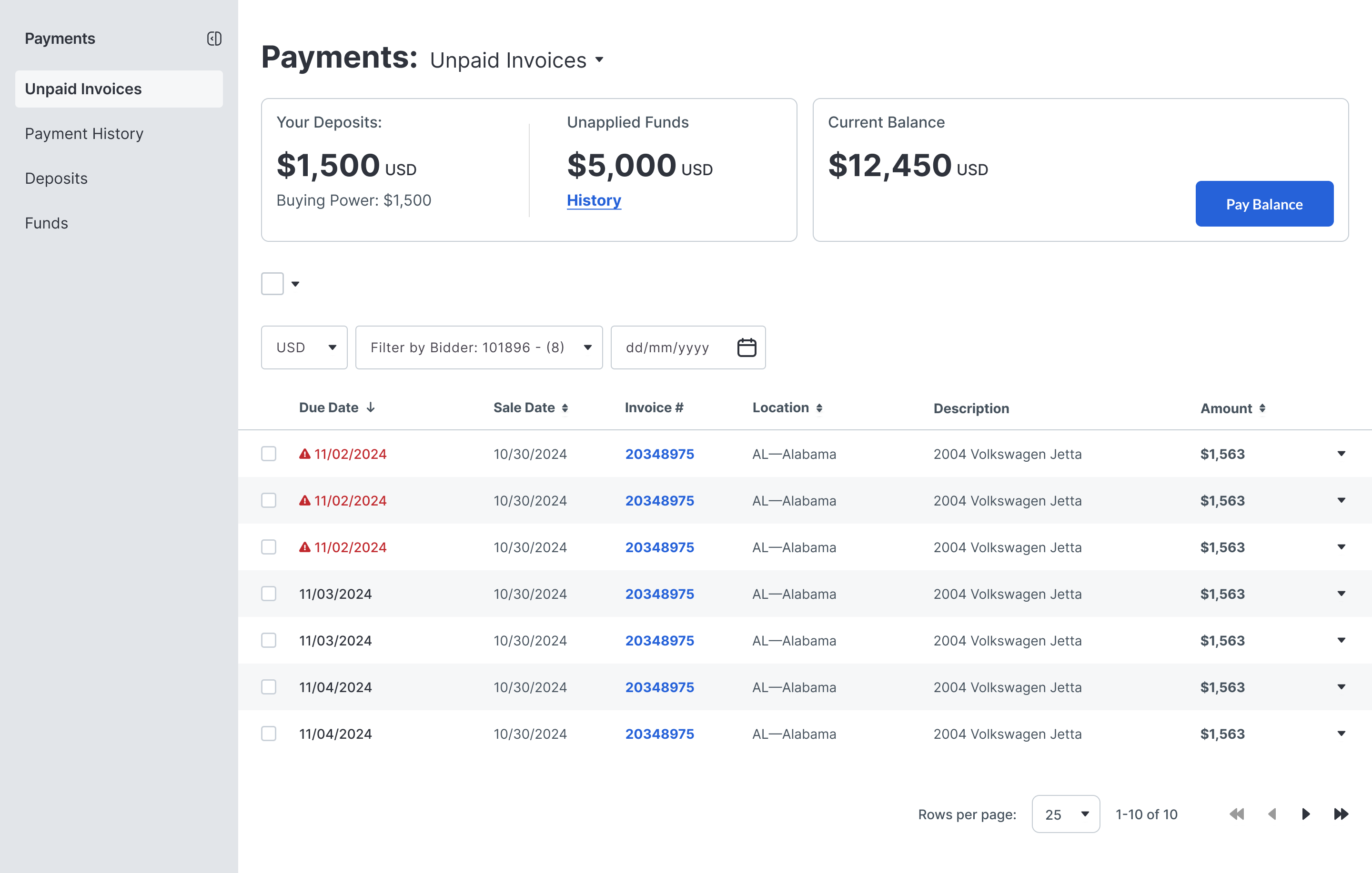

Buying cars online can be...challenging. At the start of this project, calls to our Support team surrounding payments took a giant chunk of their resources. With Copart expanding into different markets, our customers expected more payment options and greater flexibility.
With multiple buyer personas and very different needs, the payment portal needs to account for buyers who want to buy 1,000 cars at one time or 1.
With limited data and information, it's important that all existing features and functionality stay in the experience. This combined with common UI patterns can provide an experience to users that is familiar and expected.
In this redesign, Copart transitioned to Braintree and introduced new payment methods such as Apple Pay, Google Pay, and PayPal.
The Payments portal needs to be designed mobile-first, accessible, and align with the web experience.
Deposit Navigation. Members had to call to request a refund, which was frustrating for them and for our Support team.
Wire Transfers. The entire process was hand-written and manual, with the user having to track down the correct forms to use.
No audit support. If a user is audited by the IRS, the history only goes back one year, which is not helpful.
Not able to pay on Mobile Native payments and mobile responsive payments did not exist.
Little support post-payment. Vehicle delivery was not accessible via the payment portal, and users were not given the option to select how they wanted their title received in this process.
Online Refunds. Allow users to request a refund online, with clear indications as to how much they have in deposits/what's available to withdraw.
Pre-filled Wire Transfer Forms. Allow users to prefill wire transfer information. Users can select what items they want to pay for with a wire transfer, and we prefill out the information that we need on our end.
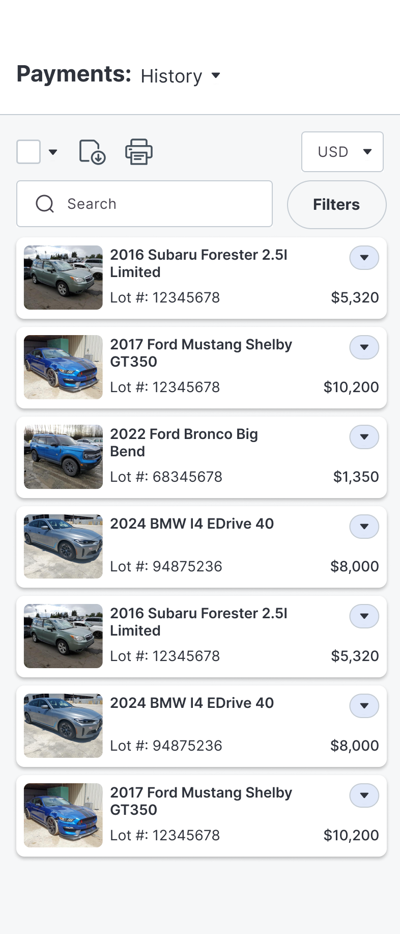
Payment History Page. Offer a history page so users have audit support and accurate records for their own business use.
Mobile First. Design a "mobile first" payment portal.
Delivery Statuses. Allow users to buy delivery within the portal and see statuses related to title and delivery.
We conducted internal reviews involving cross-functional teams such as Operations, International, IT, Member Services, Email, and Business Intelligence. These assessments provided insights into our system dynamics and gaps. We also used survey data and prior user interviews to understand diverse buyer payment preferences.
Findings: High-volume buyers often preferred to use our API, and wanted to pay as fast as possible without combing through data. Other business buyers preferred to use their desktop computer and see the information laid out. Dealers preferred to use the mobile app exclusively.
We also documented the complex post-auction flows related to payment, shipping, and title transfer to identify friction points. (These have been removed from the portfolio)
I implemented an internal payment navigation system with the strategic vision that it would serve as the central repository for all internal assets moving forward.
The primary objective behind this is to provide our users with a tailored viewing experience, prioritizing essential information and allowing them to access what is most relevant to their needs.
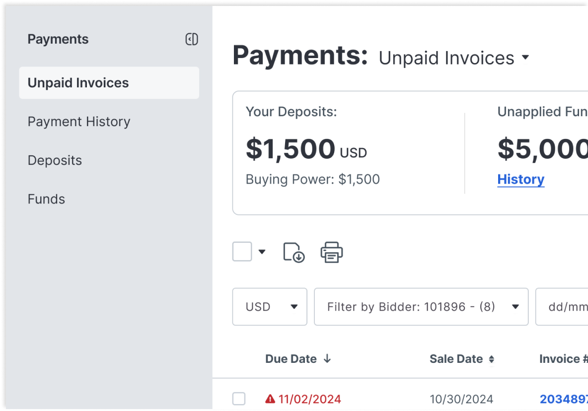
In alignment with our commitment to the 'Do No Harm' principle, we introduced a customized table view for the desktop version, aiming to maintain user familiarity.
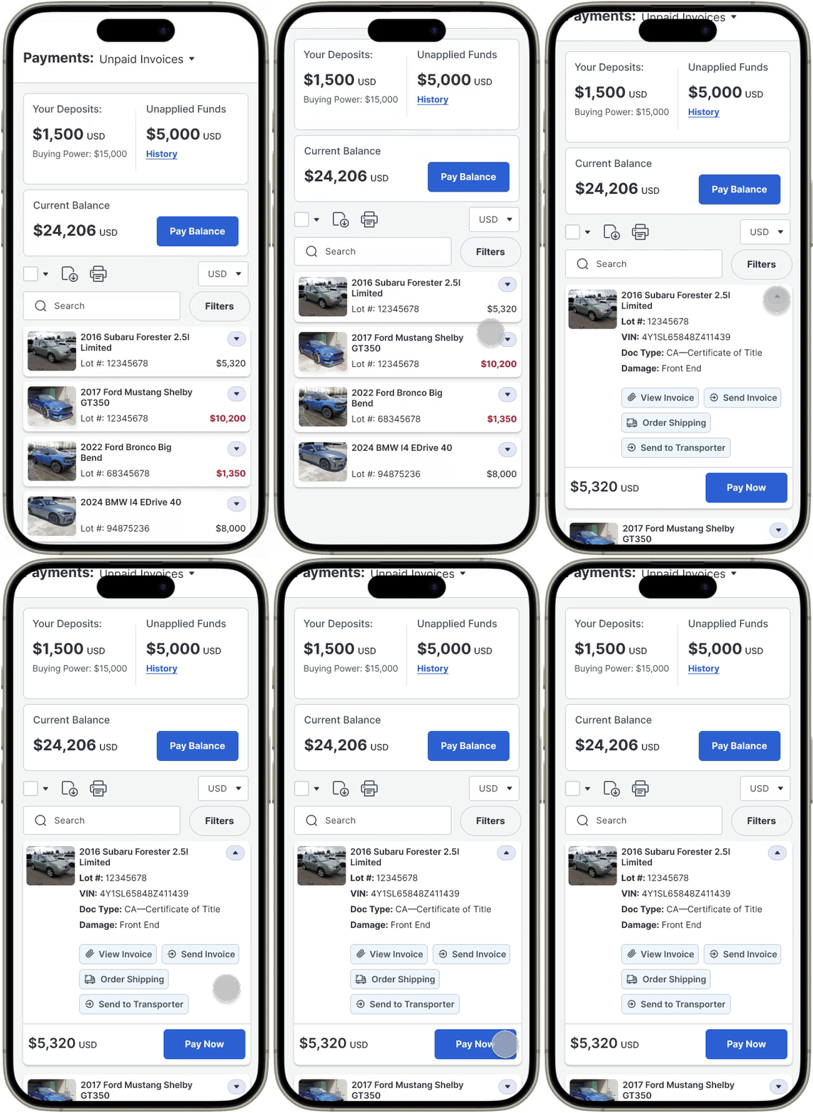
The previous version presented usability challenges due to its cluttered interface and the limited visibility it offered on narrow screen sizes. To address this, we restructured the design by placing critical information in the top bar, while secondary details were made accessible through a collapsible menu.

The previous experience didn't allow users to edit information inside of the checkout process. Additionally, vehicle shipping, title mailing, and payment preferences were handled outside of the portal, if at all. I wanted to implement a system that could handle all of that information simultaneously while adhering to common ecommerce platform experiences.
Previously, users reported difficulty with Title Mailing. Understandably, users have different preferences on how they would like to receive their vehicle titles. Some preferred to pick it up, some preferred to have it mailed, but most notably, some absolutely did not want it delivered by their transporter. It could get lost, overlooked, or lost in the shuffle.
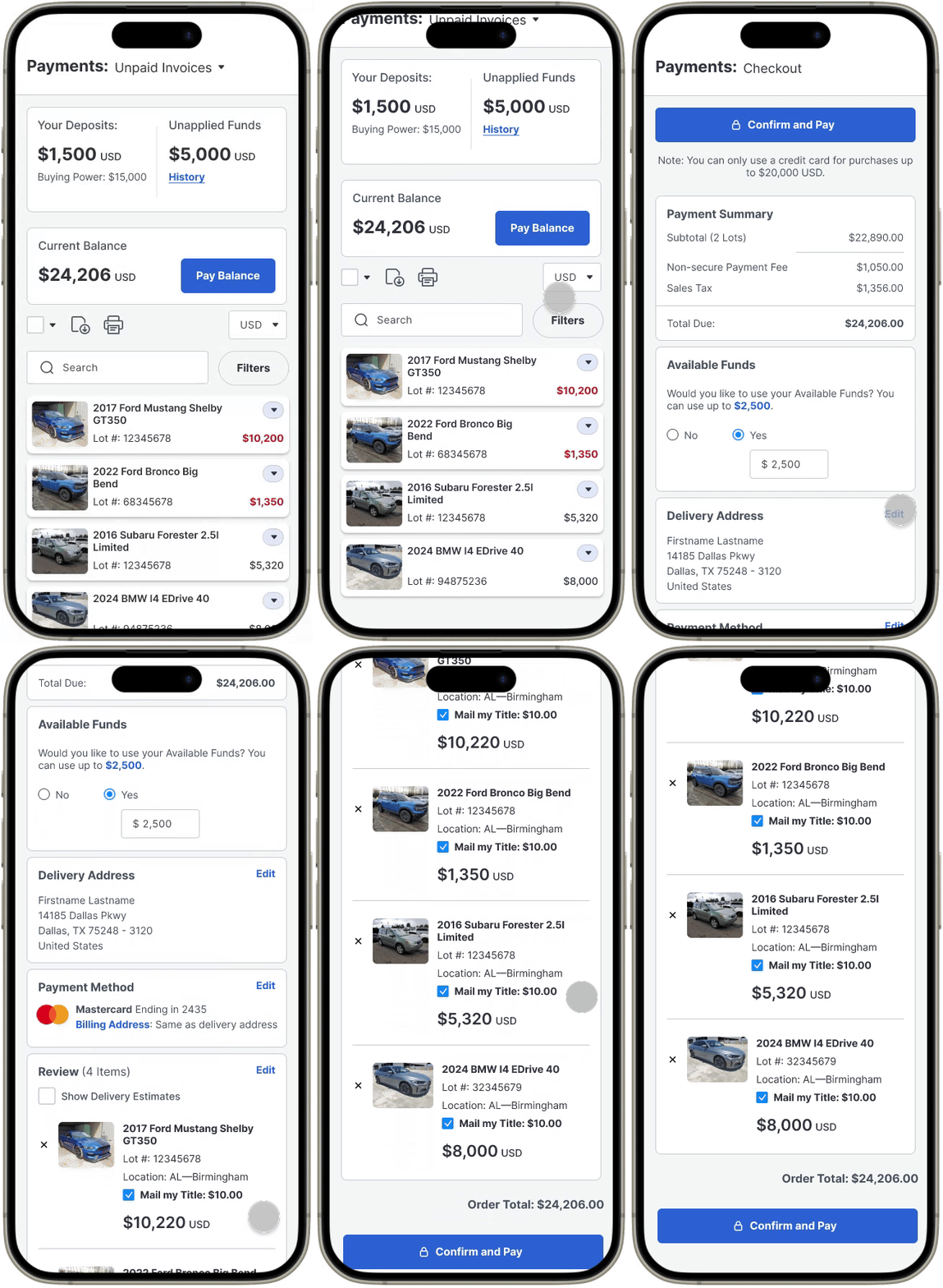
Previously, if a user wanted to increase their deposit, they would have to use a separate deposit portal. They also weren't able to change or view the payment method used to make the payment. I put it in one screen, so that it would be easier to quickly make decisions.
We also use a lot of confusing terminology, but the functionality behind each is necessary. I tried to create visual hierarchy to distinguish between the different items so users could learn to differentiate.
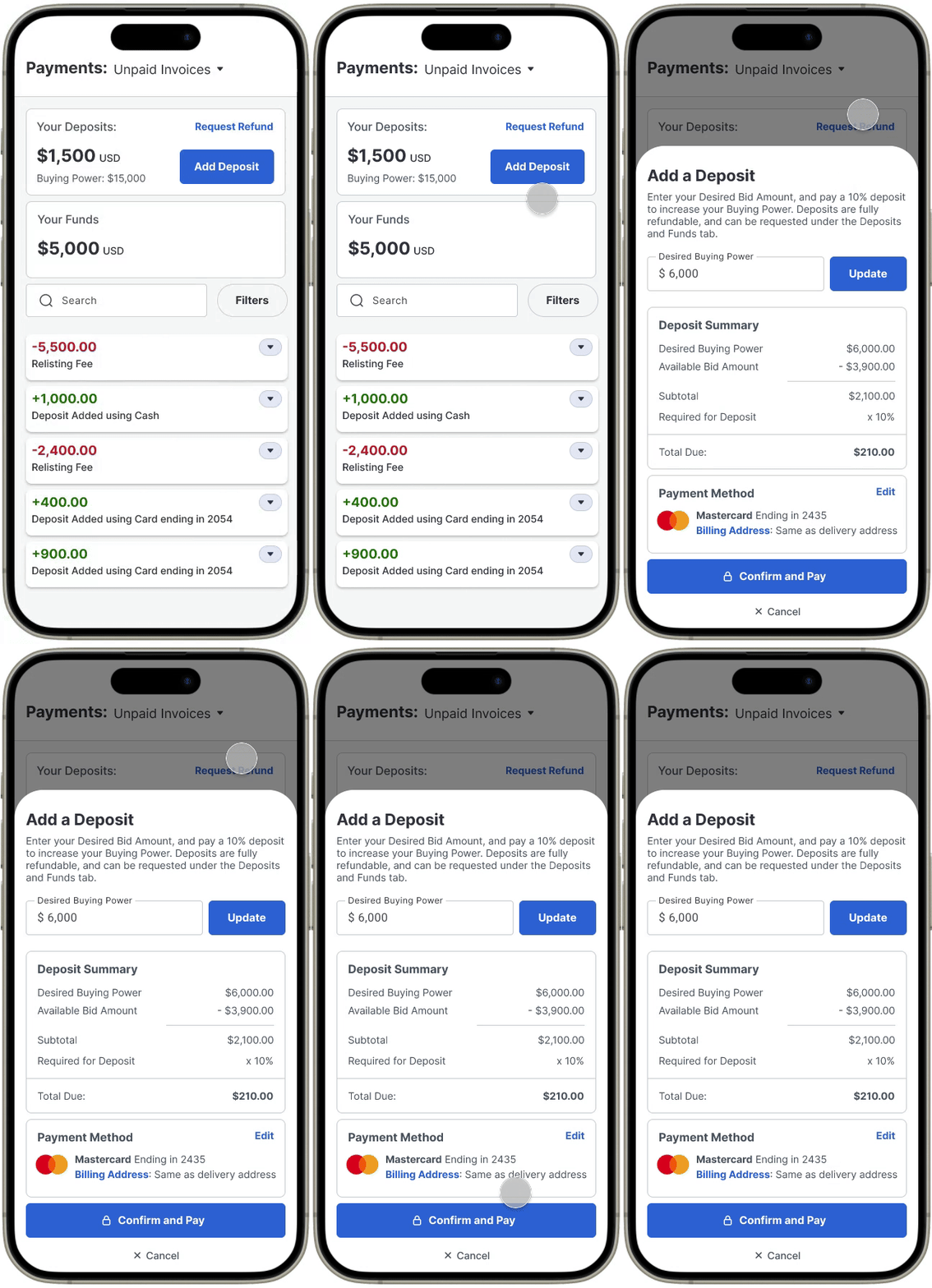
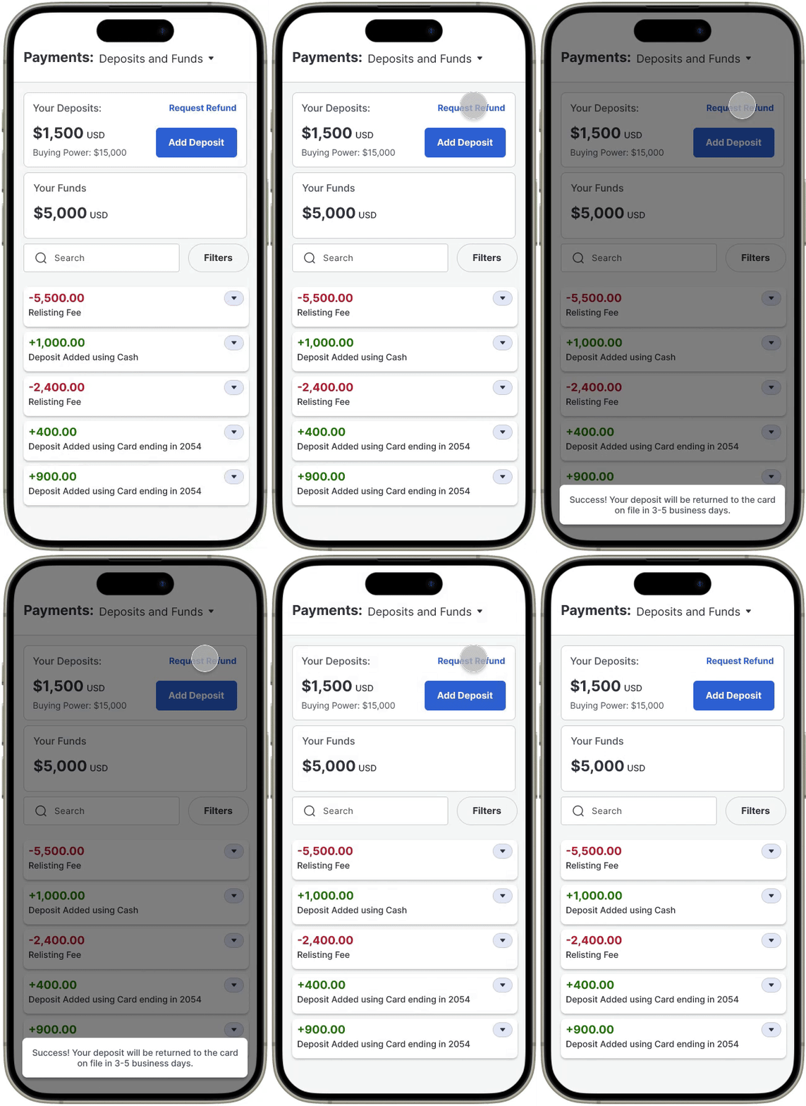
If users wanted to get a refund on their deposit, they would have to call our support team. It's also worth noting, that all Basic Members were required to submit a deposit to sign up for an account. This deposit could also not be used to apply to a vehicle, so it meant that 100% of users had to call our support team to get their money back. Deposits are 100% refundable, but it requires that users don't have any outstanding payments. Now, if a user wants a refund, it's just a click of a button.
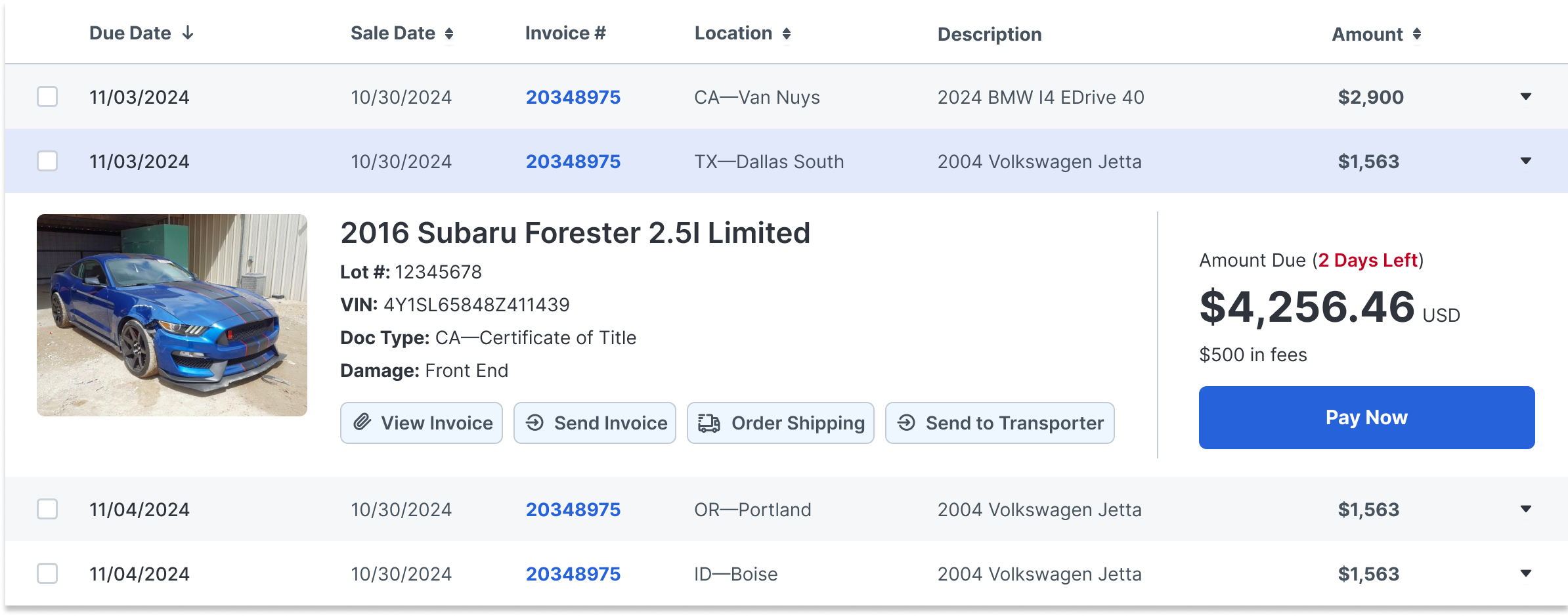
Before a user pays, they can take other actions, like viewing a detailed view of their invoice, or set up shipping.

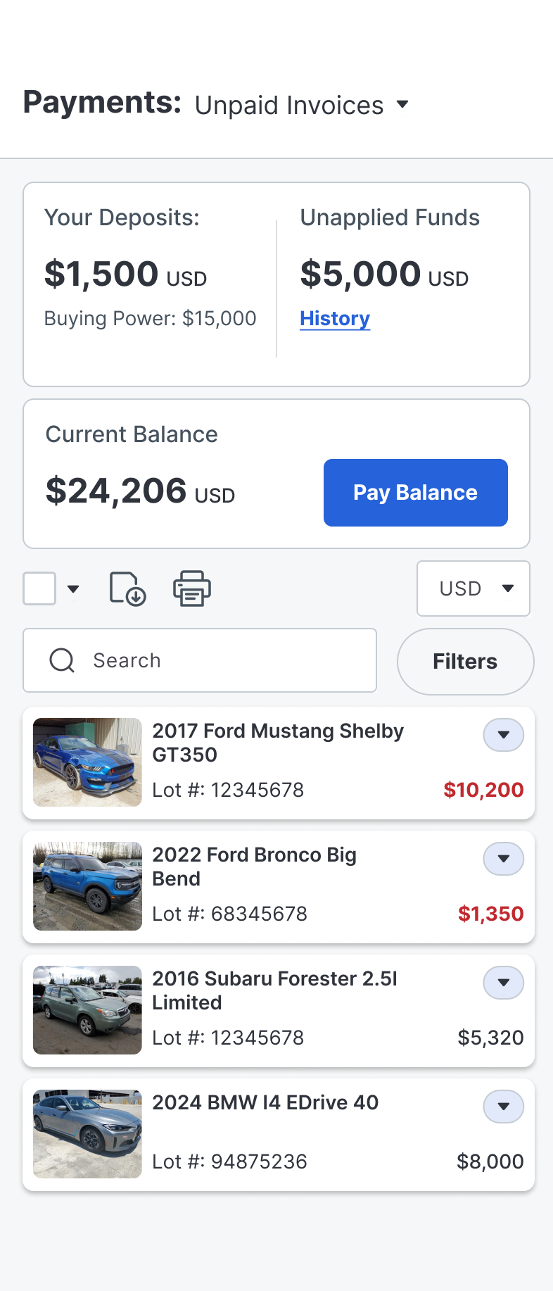


Late Fees were reduced by 30%. This can be attributed to a couple of factors: Wider range of payment methods accepted, adding the due date as the first line item, and adding native payments to the mobile app. Increased online payments from 40.25% to 60% as opposed to in-person payment methods. This eases friction for our users and for our yard workers. Overall phone calls around payments decreased significantly.